Agency
Projects
Work with us
Menu
Menu
Close
Agency
Projects
Culture
Inspirations
Work with us
Français
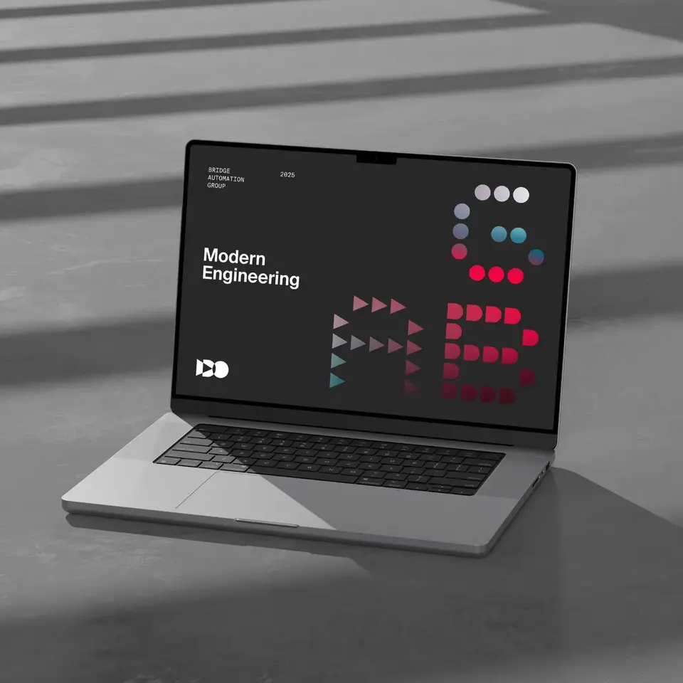
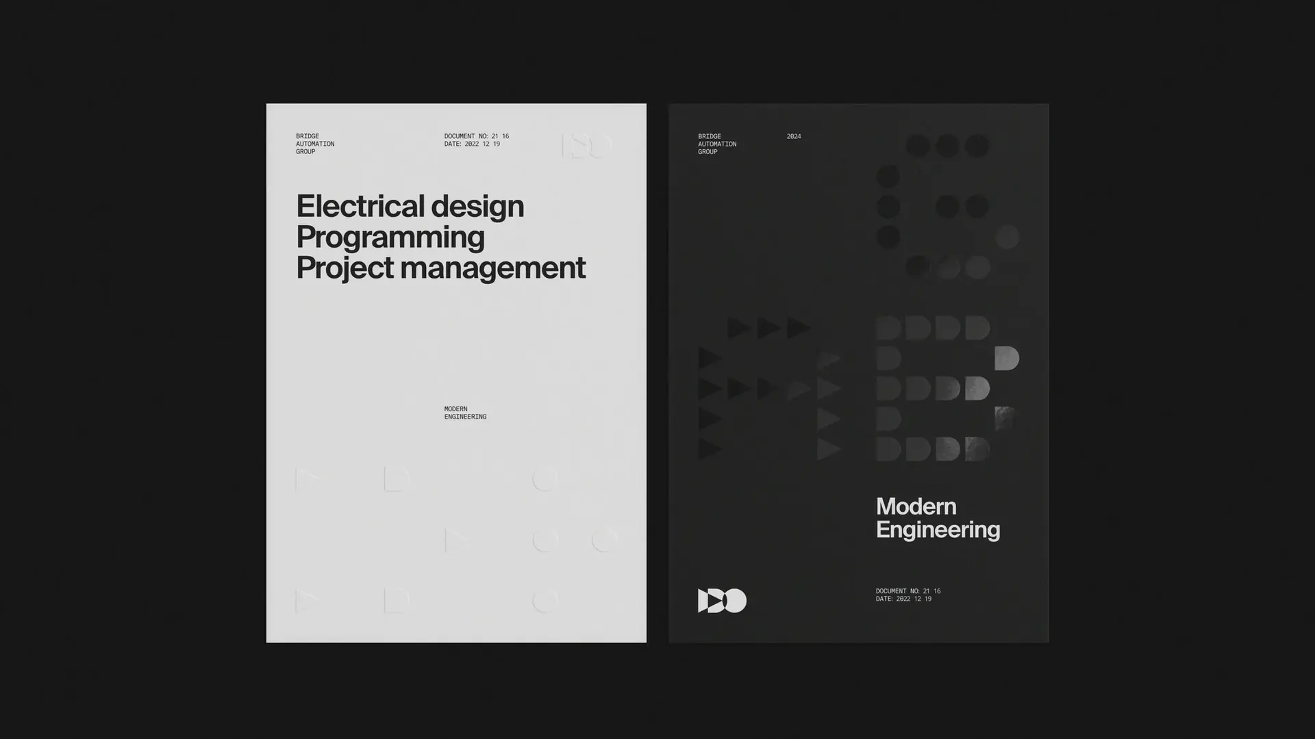
Rethinking the world of industrial automation.
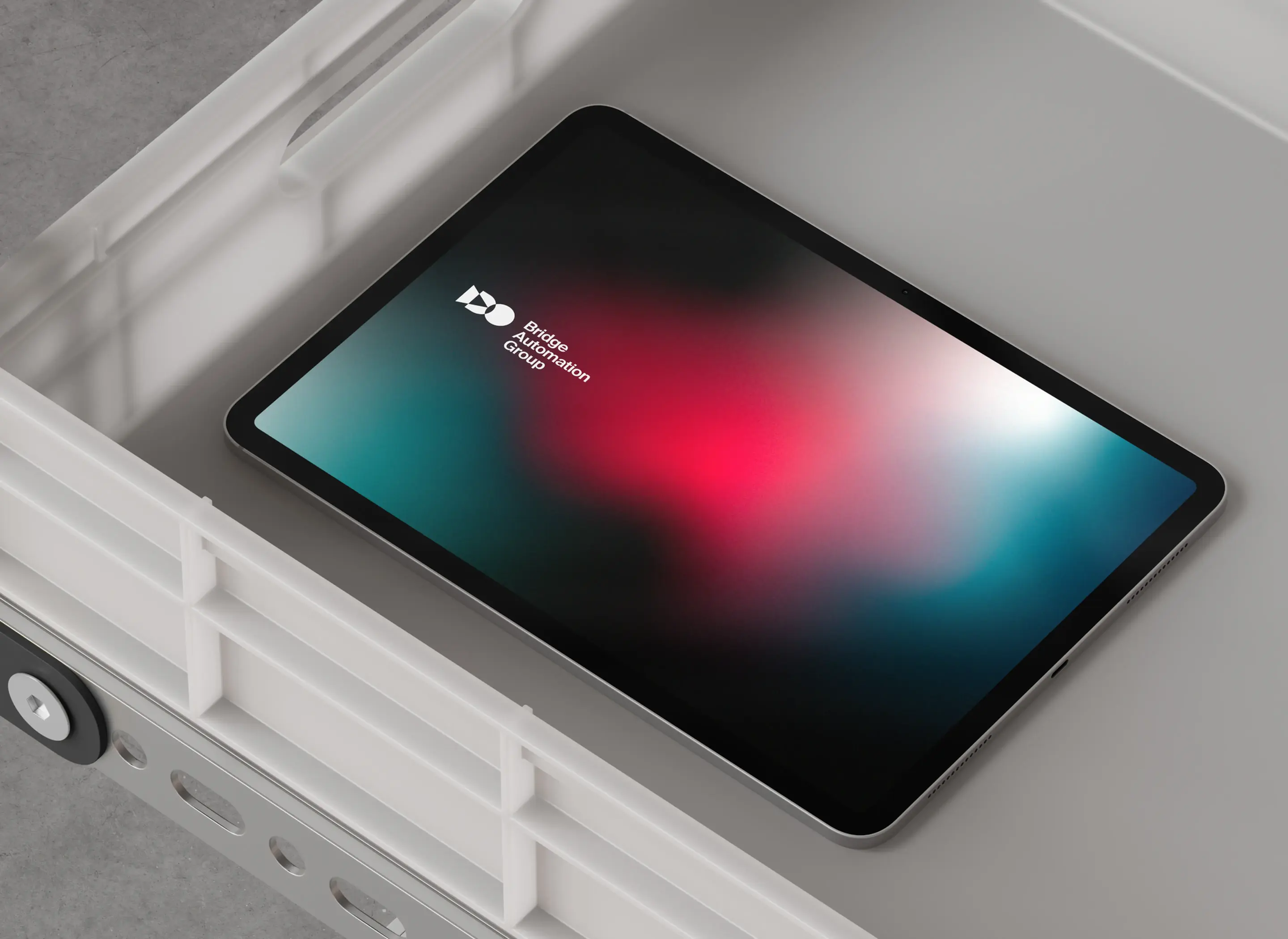
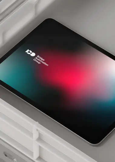
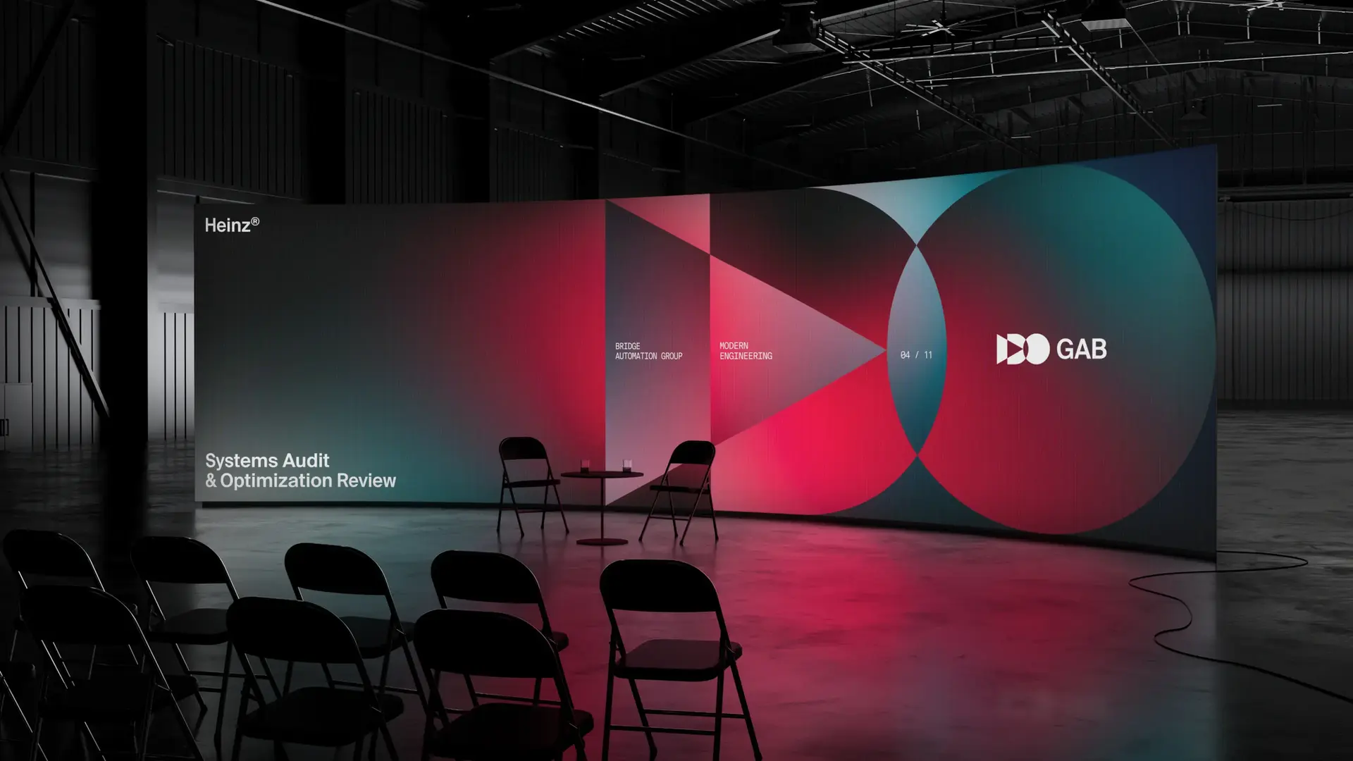
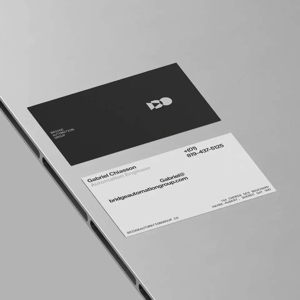
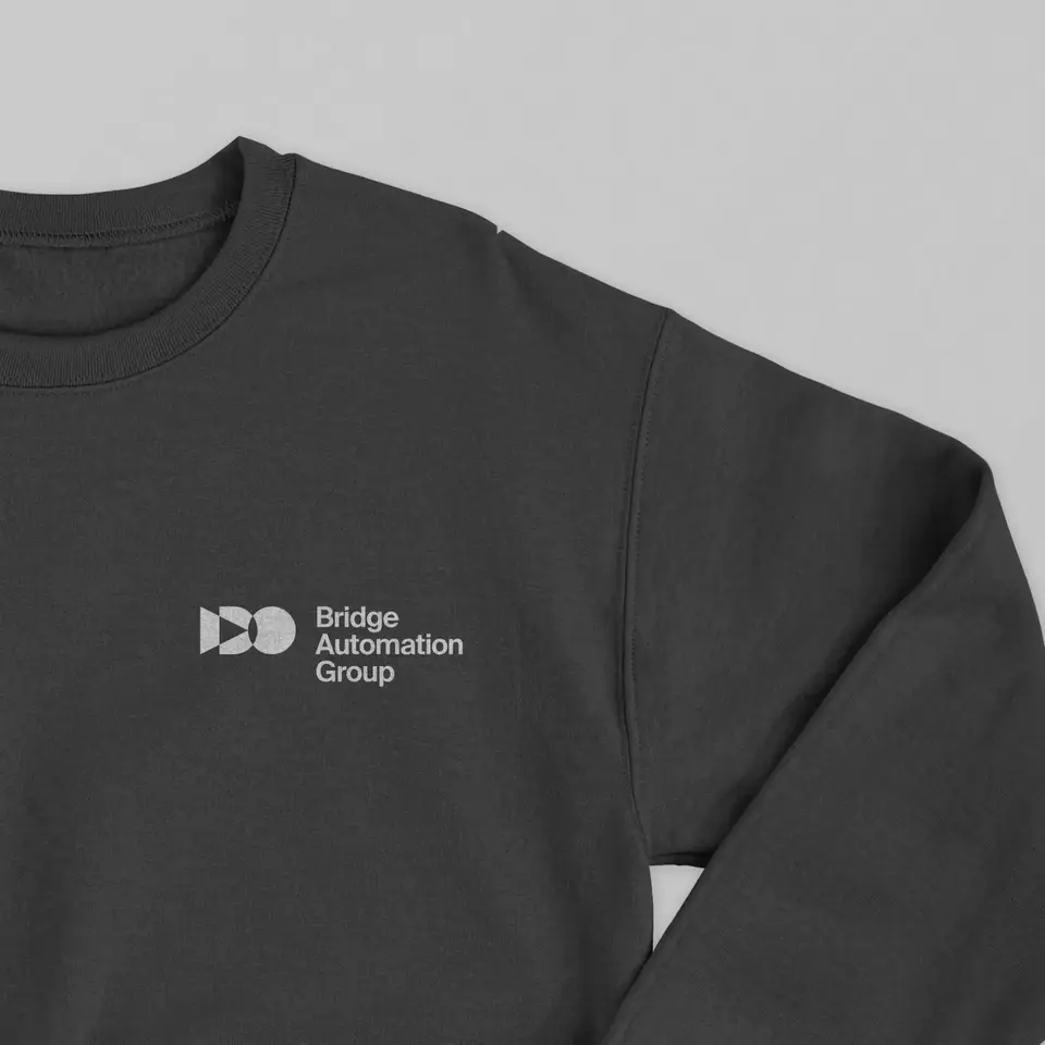
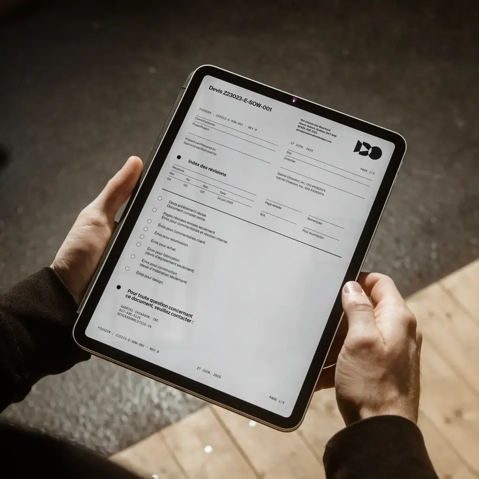
Automation Group Bridge
Brand Strategy & Visual Identity
Breaking traditional engineering norms for a new generation of entrepreneurs
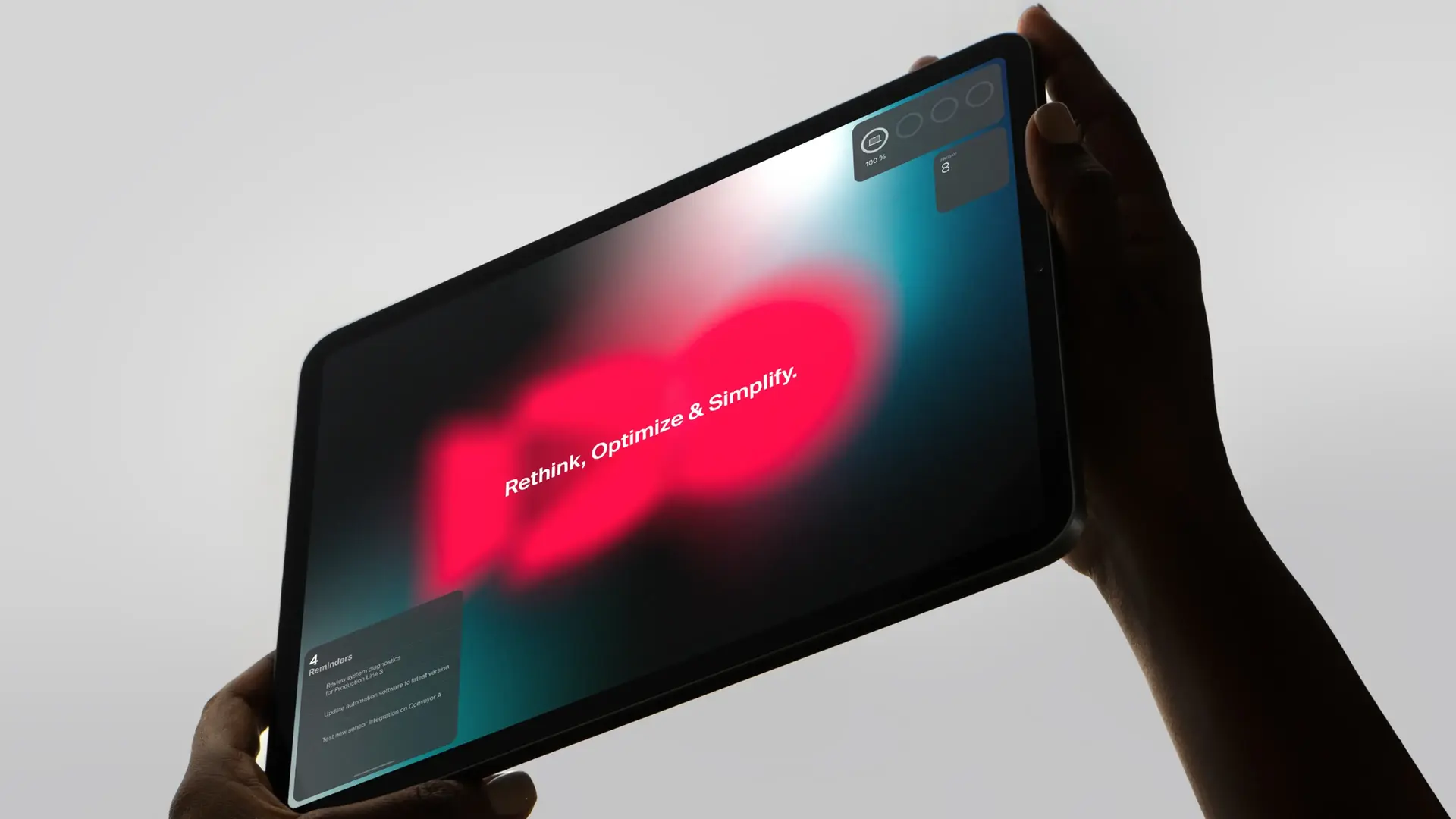
Driving the future forward through the core principles of automation
Making the shift
From hands-on experience to technological innovation
Next project
Conseil des Arts de Montréal
Conseil des Arts de Montréal