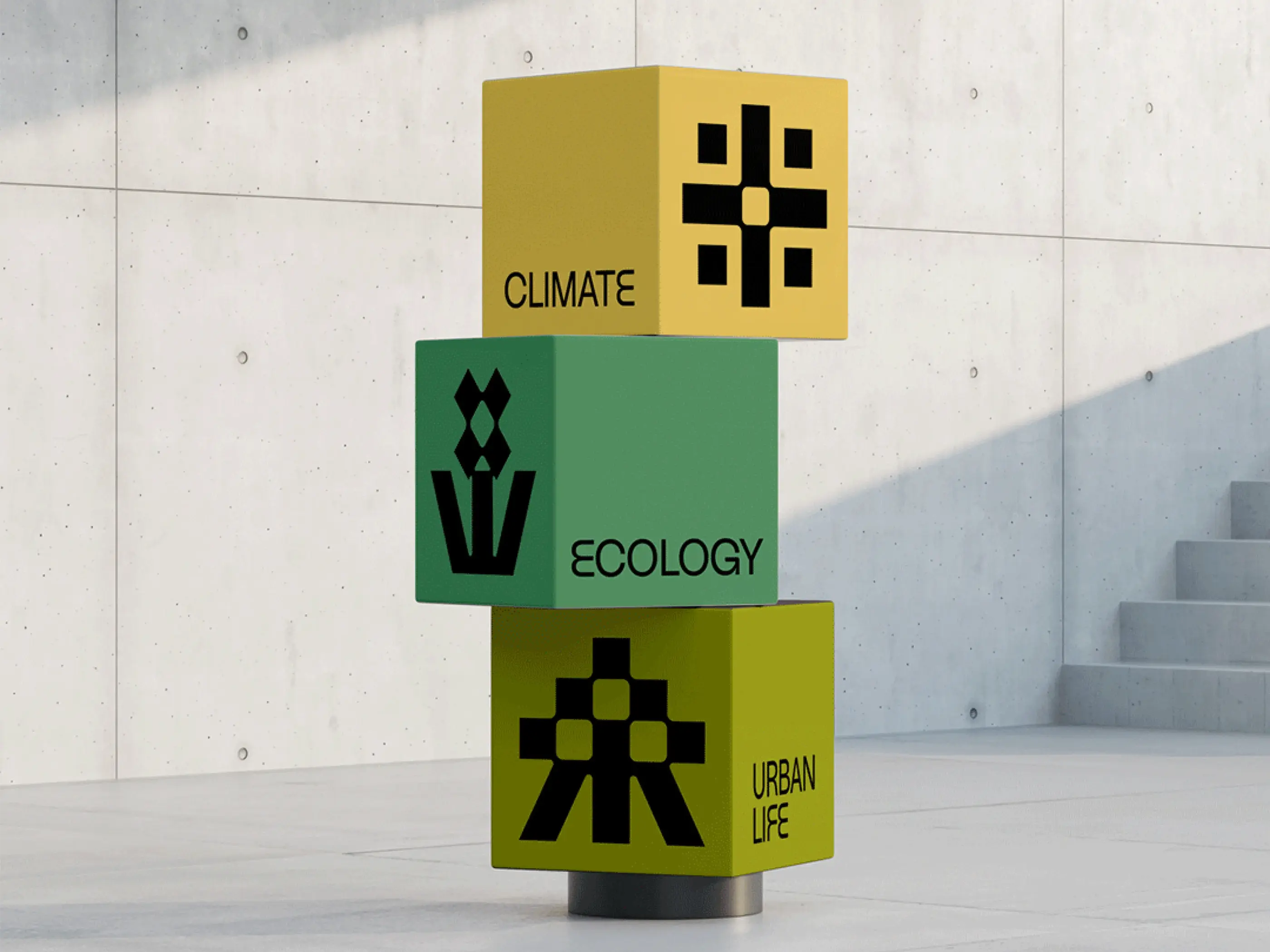
A 'Curb cut' is the small slope that connects the sidewalk to the road, thus facilitating the movement of people in the city, especially those using wheelchairs or pushing strollers. Therefore, we drew inspiration from this element to create abstract shapes symbolizing connection and inclusive mobility. The colors are contrasting and accessible for a lively and warm outcome.


It offers an approach to urban issues focused on justice and inclusion, integrating the widest possible range of information to help inform interested citizens, communities, researchers, and policymakers.
We were commissioned to give shape and color to the data collection platform by creating a vibrant and warm brand identity that can be adapted for several other cities.