Lagoon Seafood
Making a good first impression is important. In addition to its website in need of a facelift, the brand identities of Blue Tide and Royal Harbour required a serious refresh. So, we set sail for this exciting challenge, with the intention of showcasing Lagoon Seafood's values through its products: quality and trust.


Enhancing and modernizing the image of such an iconic brand as Blue Tide is no small task. Marketed to distributors, food service, and renowned retailers like Adonis, we wanted a strong image paired with a fresh and sleek look.
A palette of light blues and flying seagulls immediately emerged to express the freshness of a sea breeze and evoke all seafood products at once. To emphasize the connection between Blue Tide and Lagoon Seafood, its name was also added to the logo.


Acquired by Lagoon Seafood, Royal Harbour has always been a name associated with traditional products, exclusively for retailers and large-scale distribution. To stand out from competitors even on the shelves, we set sail for redesigned packaging in invigorating colors.
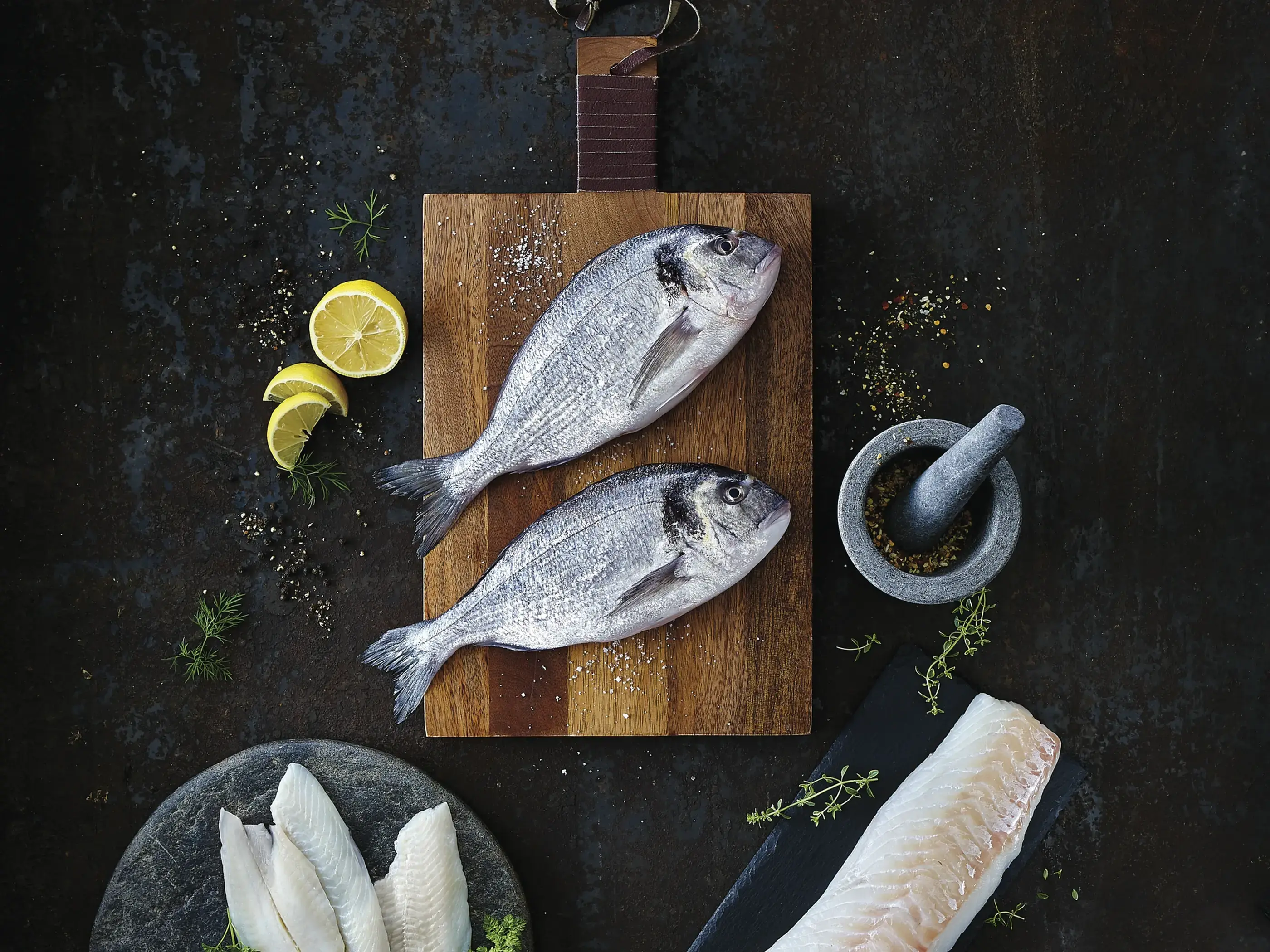
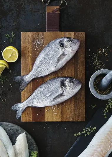
A photo shoot also allowed us to harmonize the graphic material for the web, print, and digital displays. Product images in their simplest form attest that quality and freshness do not need embellishments to appeal. The result? A refreshed look that remains classic and refined.


