We hence redesigned the logo, keeping the essentials such as the colours and "a", and adding subtle meaningful designs such as the "x" with a dot (representing a roof with a window, throwing back to their core business: pop up construction). With this strong and proud logo, we also designed t-shirts, booths, and ultimately built the website around this identity. This state-of-the-art website was strategically designed to point out different strengths.
Indeed, we reformulated each section and added a “culture” section to give the brand more depth and life. Our plan was to render their communication simple, clear and to the point. This is where our UX and UI expertise came into play, merging design and communication strategy. We chose to integrate several impressive projects they had under their belt to the website. The idea of a portfolio section was to demonstrate the variety the company could handle.
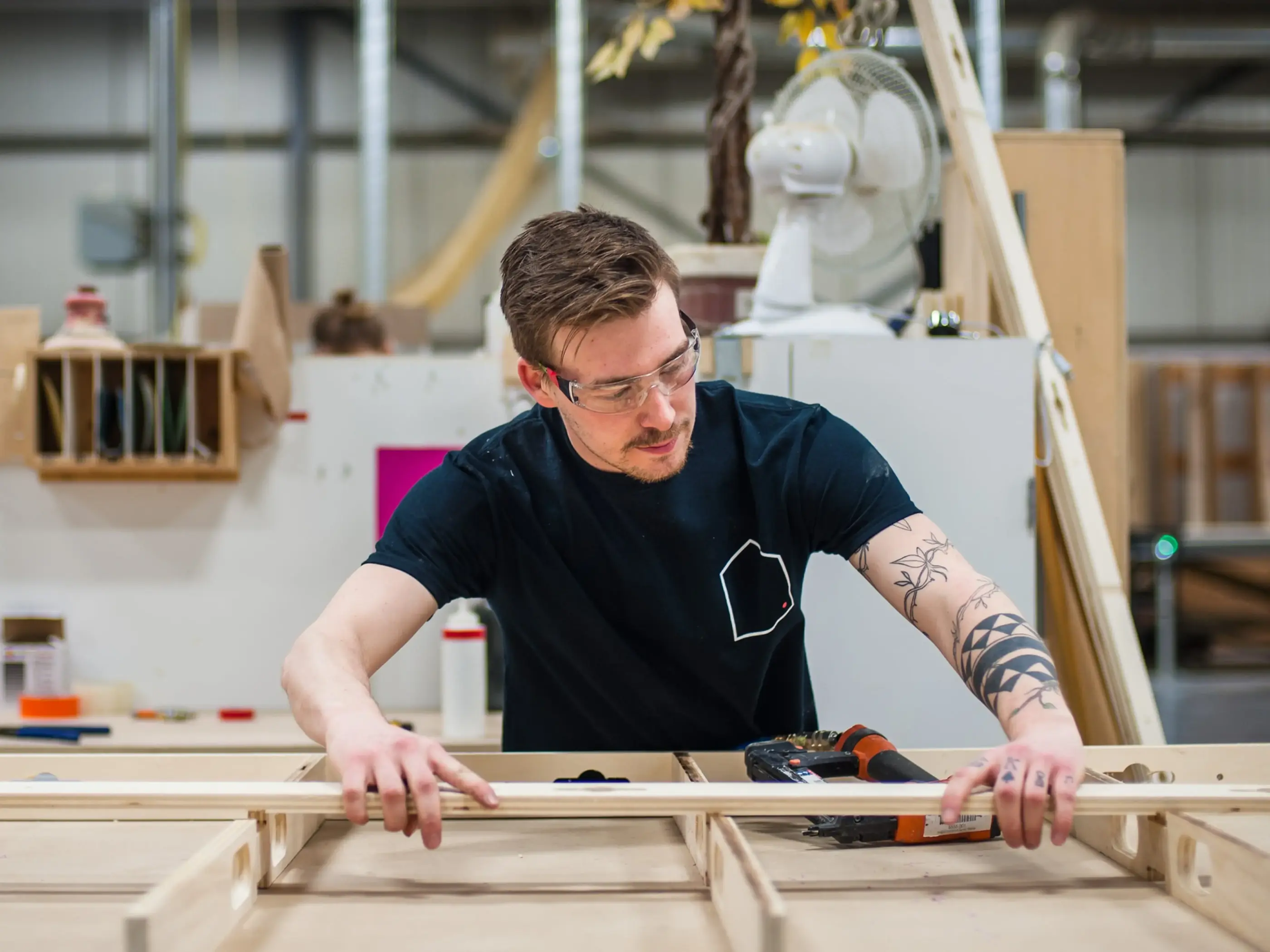
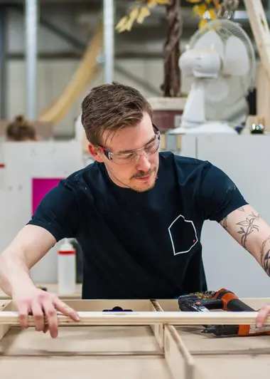
We also shot and edited their homepage video. As storytellers, we wanted to represent the pride, precision, hard work, planning and teamwork that goes behind a pop-up stand. The idea was to show a behind the scenes, with a finished product to demonstrate their capacity.


Accordex is a company, with international clients, focused on building temporary or permanent physical environment for events, trade shows and retail.