ClicknPark
We book our flight before heading to the airport. We book our hotel before we arrive. We book our ride before we leave home.
Yet when it comes to parking, we still often wait until we get there to start looking: driving around, hoping a spot opens up, without knowing where to park, how much it will cost, or whether we’ll make it on time.
With clicknpark, parking is no longer an uncertainty to deal with upon arrival. It becomes part of the journey you can plan ahead.
There’s no need to invent a new language for parking. The “P” is already understood everywhere.
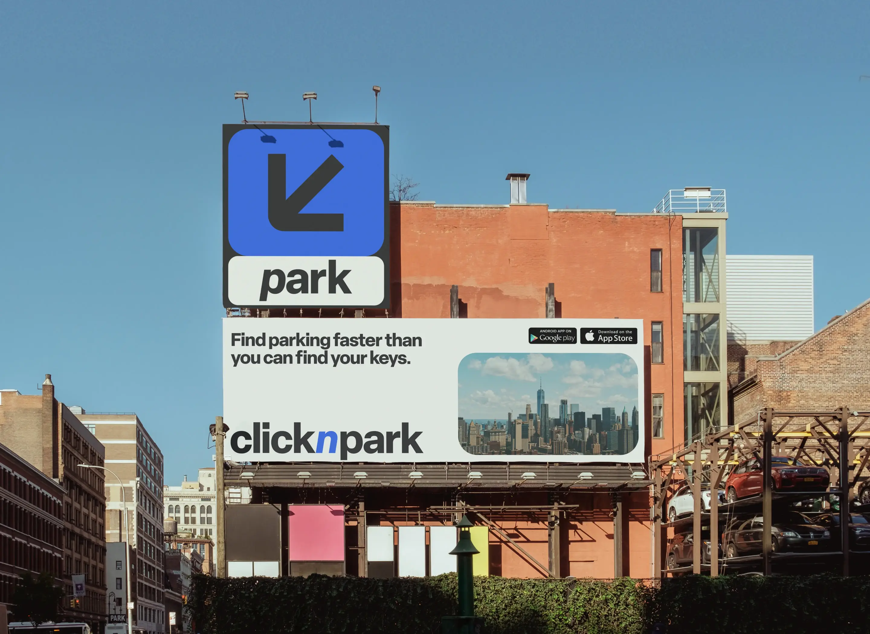
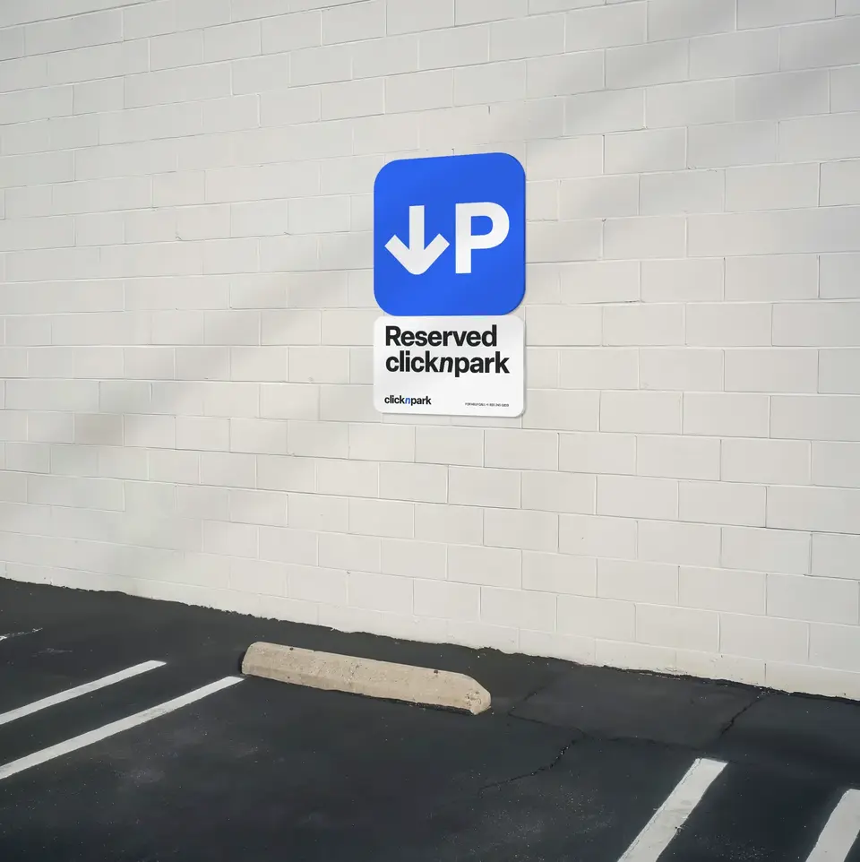
clicknpark’s identity builds on this universal symbol by adding an arrow. A simple gesture that turns the “P” into a directional cue and directly expresses the brand’s promise: know where to go and where to park.
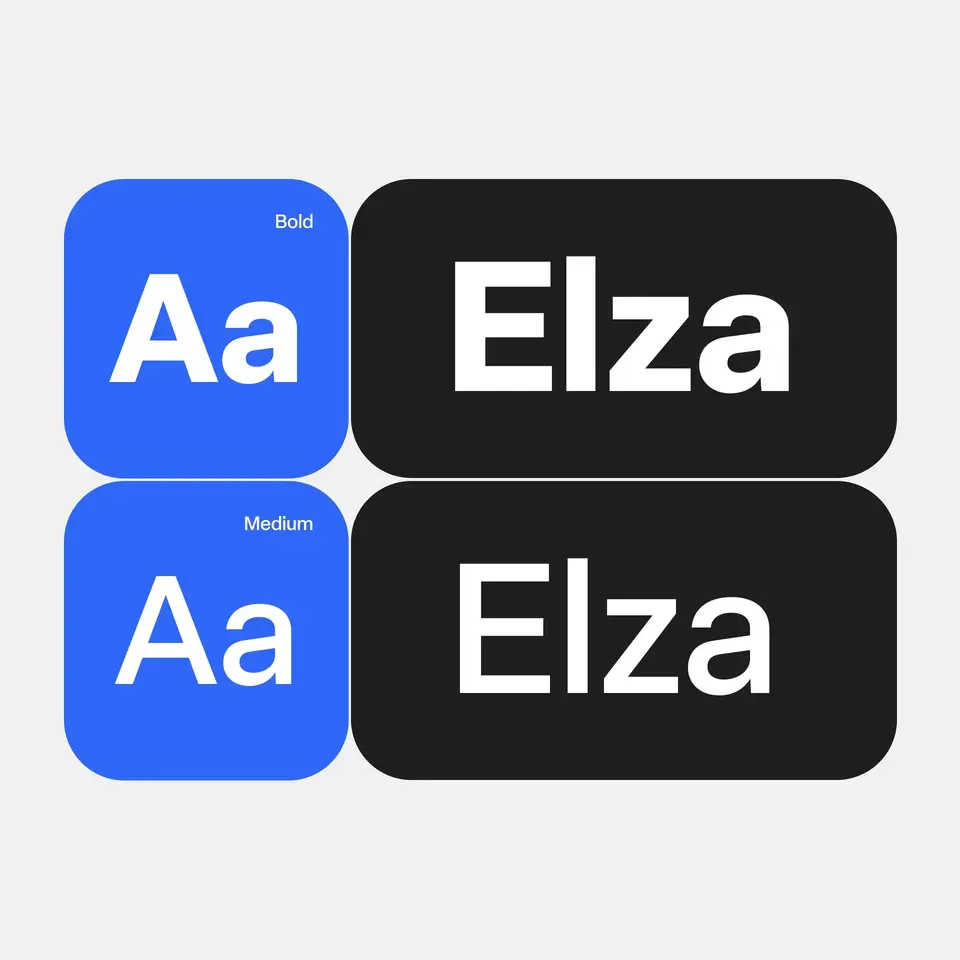
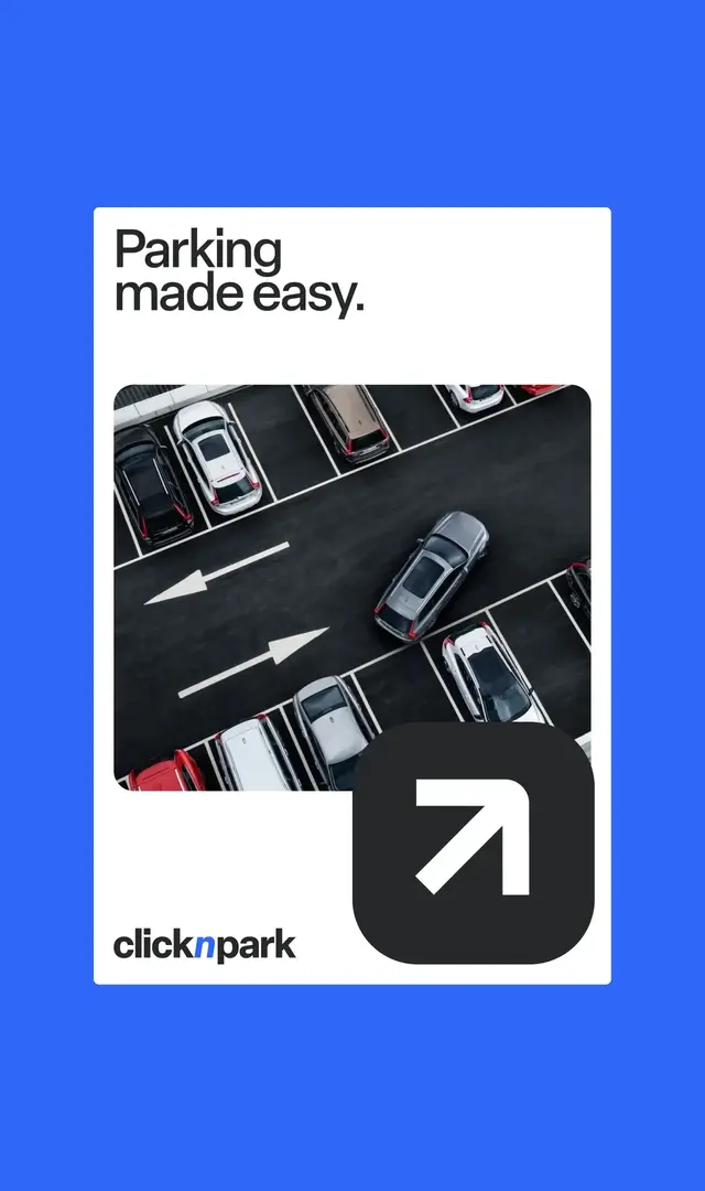
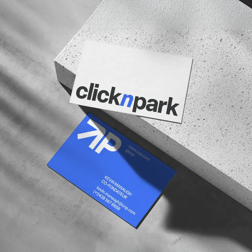
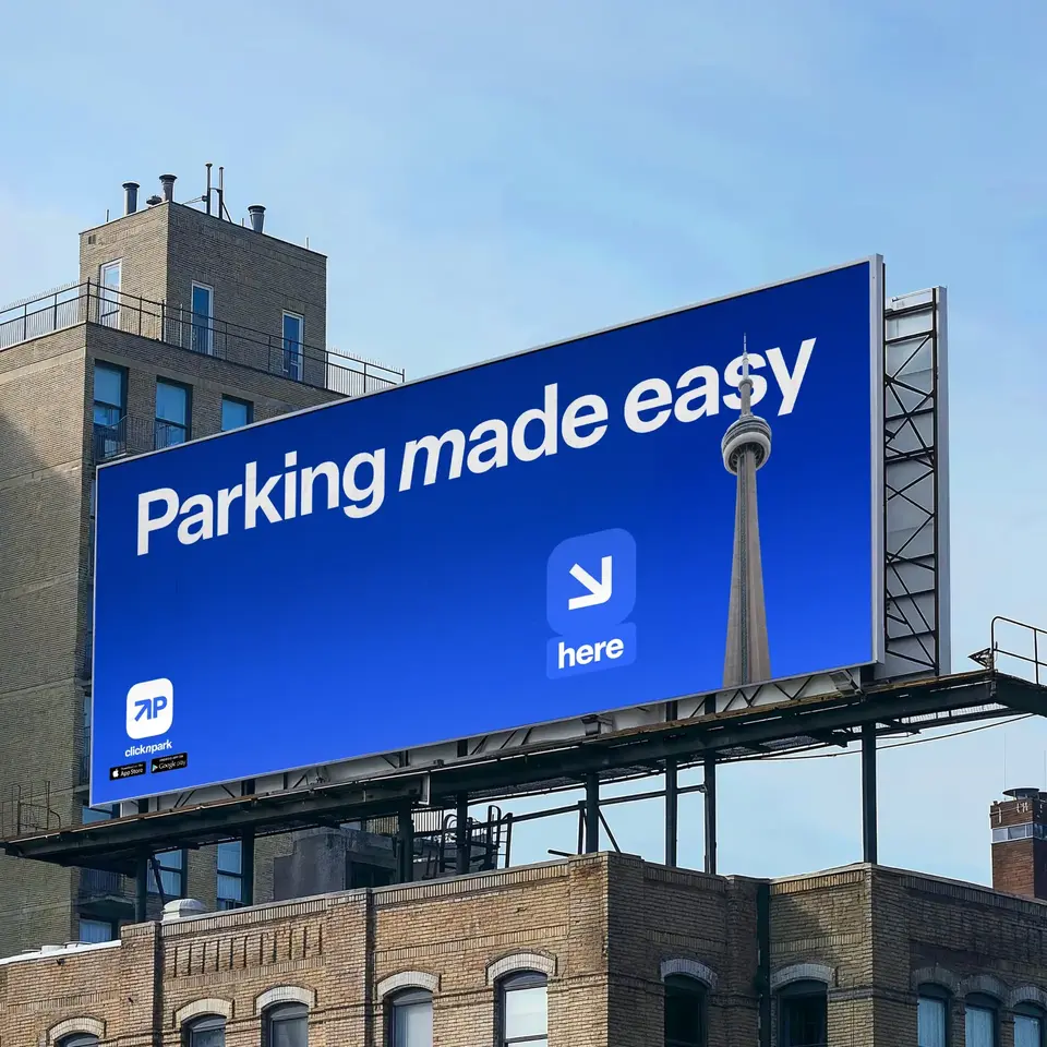
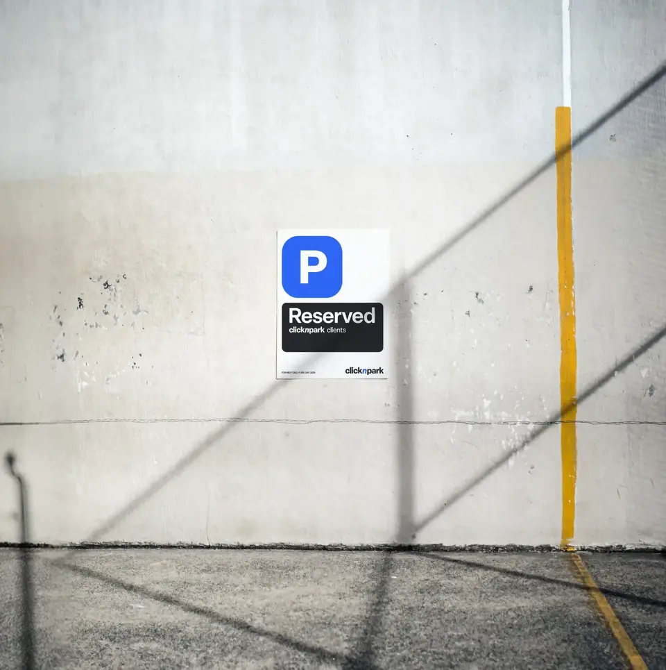
A brand is more than a logo. Here, the entire clicknpark system is present at every step of the parking experience. A clear, directional, and intuitive system that works just as seamlessly in the app as it does in the physical environment.
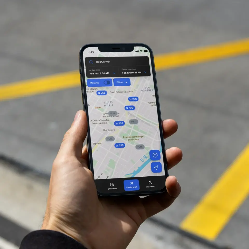
Clicknpark is about more than reserving parking. It’s a complete technology toolkit: automatic license plate recognition, barrier access, centralized payments, and access management for dedicated parking spaces.
The problem is, most people don’t realize everything it can do. The brand helps communicate the service more clearly, highlight existing features, and make the entire experience easier to understand, for both drivers and parking operators.