Led since 2000 by three associates, Danielle Bisson, Richard A. Fortin and Christian Bisson, this company is currently seeing a significant increase in its activities through its participation in several major architectural projects in Québec.
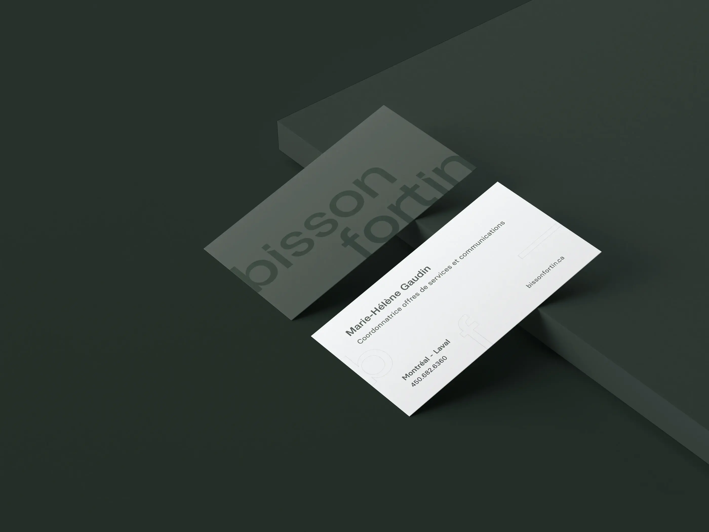
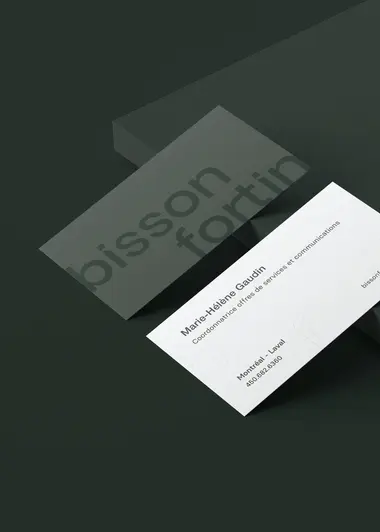
As a creative agency, our team is proud of its 360° design on this project. After establishing a global strategy, we effectively redefined the visual identity of the brand through a new and dynamic logo and a streamlined graphic charter. We then designed a completely new website to announce and showcase this new brand image, with additional communications material for branding support (newsletter, social media posts, etc.).


The first was to modernize Bisson Fortin’s brand image as to establish its positioning. To do so, we emphasized the firm’s three essential values: humanity, passion and creativity. Symbolized by three shapes (respectively, the circle, the triangle and the square), these values are now front and center in the company’s communications material and written content.
The second objective was to highlight the firm’s flagship projects to illustrate its expertise. We achieved this by creating a customized layout that allowed for the integration of several large pictures that could best showcase the various buildings designed by Bisson Fortin.
For the last objective, the aim was to attract new talent to help the firm with its new projects. On top of developing a dynamic and attractive brand image, we also decided to promote the many advantages of working for the company through the website’s Career page.


Meeting the expectations of architects, who are particularly sensitive to composition and layout, was a motivating challenge for our team. Our creative talents came up with a brand image that was both meaningful and precise in terms of design. Through in-depth research on architecture and the particularities of that field, we came up with a dynamic and streamlined logo, with bevelled “i” to represent the shadows cast by buildings.